Component Naming Conventions for a CMS Website: A Practical Guide for Digital Teams

Hello Digital Team,

I am sure everyone of us has faced this moment. You are building a CMS component library, you have a beautiful design file on one screen and the CMS admin on the other, and you are stuck on one small thing: what do we actually call this thing?

A week later the content author opens the CMS, scrolls a list of forty components, and cannot find the one they need. Small naming decisions become big authoring problems. A tiny card variation ends up as “Card Block” and “Card Block New”, and now nobody knows which to use. This is the practical playbook I have used on Optimizely, Sitecore, and headless builds over the last twelve years, written for the developers, designers, and PMs setting a library up or cleaning one up.

The library at a glance. Most CMS libraries are these shelves. The names in bold are the plain, author-first labels I use.

  • Global (kept out of the picker): Top Navigation, Footer, Cookie Consent Banner, Announcement Bar
  • Hero: one Hero, with layout and media as options
  • Content blocks: Rich Text, Two Column Text, Text and Image, Text and Video, Quote, Callout
  • Cards: Card Grid + Card
  • Media: Image, Video, Image Gallery, Logo Strip
  • Call to action: CTA Banner, CTA Card
  • Interactive: Accordion, Tabs, Timeline, Stats, Testimonial
  • Listing: Article Listing, Event Listing, Related Content

Want the full picture? The CMS Component Index Drawing Set draws all 162, labeled by scope.

Why Naming Matters More Than People Think

A component name is read by three very different people, and it has to work for all three:

  1. The content author who drags it onto a page and guesses what it does from the name alone.
  2. The developer who finds it in the codebase, styles it, and maintains its variants for five years.
  3. The designer who is adding a variation and needs to know if it already exists.

If the name only makes sense to one of them, the library drifts. Authors misuse components, developers create duplicates, and designers invent parallel versions in Figma that do not match the CMS.

💡 Golden Rule: Good naming is boring on purpose. It is clear, predictable, and hard to misinterpret. That is the whole job.

The Seven Golden Rules

  1. Name by purpose, not appearance. “Blue Banner” is wrong the day the brand turns purple. “Promo Banner” survives the redesign.
  2. Author-first language. The picker is used by marketers, not developers. “Two Column Text” beats “SplitContentBlockV2”. Keep the technical suffix (Block, Component) in the codebase, not the label.
  3. Consistent suffix or none, but pick one. Do not mix “Hero Block”, “Testimonial Component”, and “FAQ Module”. I drop suffixes from author-facing names entirely.
  4. Variants live inside the component. “Image Left” and “Image Right” are one component with a dropdown, not two. This rule alone halves a library.
  5. Group logically. Use a category prefix only when the CMS has no folders or groups. If it has them, use them.
  6. Test the name in the list, not on its own. A name is read in an alphabetical dropdown next to forty others. Write it into the full list and read it aloud before committing.
  7. A name without a thumbnail is half a label. Authors scan the picker, they do not read it. More on that below.

Global Components: The Ones on Every Page

Keep the Top Navigation separate. It appears on every page by default, so it should never sit in the drag-and-drop component list. The same goes for the footer, cookie banner, and any announcement bar. These are site-wide fixtures, not authorable sections. Treat them as their own “Global” or “Site Settings” group, admin-only.

On the Optimizely build behind these screenshots, navigation and footer are edited inside a single Site Settings item, and the underlying data models are deliberately given no composition behaviour. That one setting keeps them out of the page picker, so an author can never drag a stray “menu item” onto a landing page.

Optimizely SaaS CMS Site Settings item with Top Navigation, Footer, Cookie Consent Banner, and Announcement Bar as tabs, isolated from the page component picker
Global fixtures collected in one Site Settings item, kept out of the page component picker.

Hero and Banner Components

Heroes are where naming goes wrong first, because they have the most variants. Do not build five heroes. Build one Hero with a Layout option (Image Left, Image Right, Full Width, Centered, Video Background), a Media Type option, and CTA options. If you genuinely need something different, for example a Campaign Hero with a countdown no other hero has, name it by purpose: Campaign Hero, not Hero 2.

Content Blocks: The Workhorses

These are the components authors use most, so the names matter most. This is the set I built on the Optimizely SaaS project behind this post, and the naming is deliberately flat and plain:

  • Rich Text (single column of text, headings, links, lists)
  • Two Column Text (two columns of rich text, no media)
  • Text and Image (text and image, with a layout toggle for left or right)
  • Text and Video (same, with video)
  • Quote (large pull quote, optional attribution)
  • Callout (short highlighted block, usually on a colored background)

Avoid “Content Block A” or “Layout Variant 3”: meaningless the moment you step away. Note that Text and Image and Text and Video are two components, because the field genuinely differs (an image versus a video), while left or right is a single dropdown inside each. That is the variant rule in practice.

Optimizely SaaS CMS Add Section component picker listing content blocks with clean author-first names: Rich Text, Two Column Text, Text and Image, Text and Video, Quote, and Callout
The content-block group in the Optimizely picker. Plain, author-first names that read cleanly in a scrolling list.

Cards, Media, CTAs, and the Rest

Cards are the second place libraries explode. Resist a new card for every design. Build a Card Grid container (with Columns and Card Style dropdowns) holding a Card. Only name a card by its data source when it is genuinely tied to one: Product Card, Article Card, Event Card.

Keep the rest simple and predictable, and let options live inside each component rather than spawning siblings:

  • Media: Image, Video, Image Gallery, Logo Strip. One Video with a size option, not “Hero Video” and “Content Video”.
  • Call to action: CTA Banner, CTA Card. “CTA” is understood by every marketing team, so it is safe.
  • Interactive: Accordion, Tabs, Timeline, Stats, Testimonial, Testimonial Carousel. The items inside (Accordion Item, Tab Item) are nested children, not standalone picker entries.
  • Forms: Contact Form, Newsletter Signup, Event Registration Form, Gated Content Form. Name these by purpose even when the underlying form is the same.
The CMS editor for a promo panel on the left, showing Image, Eyebrow, Title, Body, CTA label and CTA link fields, with the rendered result on the right
Image, eyebrow, title, body, one action. Adobe calls this a Teaser, Sitecore a Promo. The caution: avoid the word Card here if Card already means the item inside a Card Grid.

Listing and Dynamic Components

These pull content from elsewhere in the CMS: Article Listing, Event Listing, Product Listing, Related Content. Put the filter and sort options inside the component. Do not create “Article Listing by Date” and “Article Listing by Category” as separate components.

A CMS editor showing a content listing component with Heading, Content type, How to choose items, Tag, Hand-picked items, How many to show, and View all fields, next to the rendered row of event cards
One component, a content type dropdown, three selection modes. The alternative is eight near-identical components that all do the same job.

Handling Variants Without Creating Chaos

Every project hits the “can we just add a small variation?” moment. My rule of thumb:

  • Changes layout only (position, columns, alignment) is a variant. Add a dropdown.
  • Changes content structure (new fields, new data source, new workflow) is probably a new component.
  • Exists only for a temporary campaign? Build it behind a flag and remove it after. Do not leave campaign components lying around for years.

Here is that rule made concrete. Text and Image does not ship as “Text Image Left” and “Text Image Right”. It is one component with a single Layout dropdown, and Callout handles its colour the same way, through a Tone dropdown rather than four coloured copies. Two dropdowns standing in for six components.

Optimizely CMS block editor showing the Text and Image component with a Layout dropdown set to Image right or Image left, and a Callout component with a Tone dropdown for Info, Success, Warning, or Neutral
Variants as dropdowns, not components: Text and Image carries a Layout toggle, Callout carries a Tone toggle. Neither spawns a duplicate block.

Naming the New AI Components

This is the newest and messiest shelf in the library, so it is worth a rule before it fills up. Most “AI” features are one of two things, and teams mislabel both. The mode switch you now see next to All and Images, the toggle between a keyword list and a generated answer, is a variant: another tab in a row of tabs, sharing the structure of its neighbours, so it belongs as an option inside your existing search or filter component, not as a standalone “AI Mode Toggle”. The generated answer itself is a real new component, because it carries fields nothing else has: streamed body, citations, a source list, follow-up prompts, a disclosure line, and a generating state. Its parts are nested children, the way an Accordion Item lives inside an Accordion.

Name the component for what the reader receives, not the technology behind it. Keep the word “AI” only where the reader genuinely needs to know the text was machine-generated.

Component Thumbnails: The Part Everyone Skips

This is where naming stops being a wording exercise and becomes a usability one. Authors do not read the picker, they scan it, flicking down forty entries looking for a shape. A thumbnail skips the translate-word-back-into-shape step entirely. Every serious CMS supports one, and almost nobody fills it in, because it falls in the gap between design and development. So ask for it: make the thumbnail a named design deliverable.

Use a plain wireframe, not the polished design. It survives the rebrand and answers the author’s real question (“where does my stuff go”).

The mechanism differs on every platform, which is half the reason it gets dropped:

Platform Where the preview lives
Optimizely CMS (PaaS / .NET) An attribute on the block or page type pointing at an image path, with convention-based pickup when the asset matches the type name
Optimizely CMS (SaaS / composable) Not supported out of the box today. The content-type schema has no thumbnail field, and the Add Section dialog shows a generic icon for every component. See the note below.
Sitecore A thumbnail or preview field on the rendering item, surfaced by SXA and similar toolboxes
Umbraco A thumbnail path and icon per block in the Block List / Block Grid configuration
WordPress (Gutenberg) An icon plus an example definition that renders a live preview in the inserter
Adobe Experience Manager A component icon or abbreviation, with a thumbnail used by the component console

A note from a live Optimizely SaaS build. I tried to do exactly this on the SaaS product while writing the post, and it is worth reporting honestly. There is no built-in way to assign a preview image to a component today. I added a thumbnail field to a block in code and pushed it, and the Content Management API rejected it outright: the field does not exist on the content type. Optimizely confirmed the same, that custom component thumbnails would currently need a feature request or a custom solution, and the Add Section dialog shows a generic icon for every component in the meantime. This is exactly the kind of gap that tends to close quickly on an actively developed SaaS platform, so I hope and expect it will arrive before long. Until it does, on Optimizely SaaS your names are carrying the whole load, which is all the more reason to get them right.

The reason thumbnails get skipped is process, not effort. Make the component deliverable design + states + thumbnail (three files, not two), give the component register a thumbnail column, and include “renders correctly in the picker” in ticket acceptance. The CMS Component Index Drawing Set gives you 162 generic plates to start from.

A Worked Example: Two Real Components

Here are two components from a live build. Both keep their names, and the reasoning for keeping them is as useful as any rename.

“Curated Content” takes a content type and three fill modes (Latest, By tag, Hand-picked). It is a good, author-first name, with one honesty wrinkle: only one of its three modes is literally “curated”, so on a brand new build I might reach for Content Collection. But that is a day-one preference, not a reason to migrate a shipped component and re-point every reference for a marginal gain. The real win is the shape: one component with a content-type dropdown replaces the eight listing components many teams build.

“Highlight Card” is image, eyebrow, title, body, one CTA, as a wide feature panel. There is a general lesson attached: on a big library, watch the word Card, because Card usually already means the item inside a Card Grid, and AEM would call this a Teaser, Sitecore a Promo. On this build it does not collide (there is no Card or Card Grid beside it), it reads clearly for the daily authors, and it is shipped. So the guidance is layered: reach for Teaser or Promo Panel on a new build, and do not migrate a shipped name that is already clear.

Two things travel out of this. Get the shape right before you fuss over the word, and treat a naming rule as a design-time tool, not a license to churn shipped content. Before you commit a name, write it into the full alphabetical list and read it aloud. Collisions are invisible in a design file and obvious in a dropdown.

Who Owns Naming, and a Short Checklist

Both designer and developer, but not equally. The designer proposes the name and the thumbnail at design time, because they know the visual family it belongs to. The developer validates it against the codebase and the CMS, and wires the thumbnail in. The content lead has final sign-off, because they are the daily user. I run a fifteen-minute naming review at the end of each component sprint, and every name goes into a shared register (name, category, thumbnail, screenshot, one-line “when to use”). If it is not in the register, it does not exist yet.

Before you finalize any name, run the list:

  1. Describes purpose, not appearance?
  2. An author understands it without training?
  3. Consistent with the pattern, and no collision when read in the alphabetical list?
  4. Variants handled inside the component, not as separate entries?
  5. Has a thumbnail, same ratio and style as the rest, rendering in the picker?
  6. In the shared register with a screenshot and description?
  7. Content lead signed off?

Yes to all seven, ship it.

Frequently Asked Questions

Should designers or developers name CMS components?

Both, with clear roles. The designer proposes the functional name based on intent, the developer validates it against codebase constraints, and the content lead gives final sign-off based on authoring usability.

What content blocks should a CMS component library include?

Start with a small, author-first set and grow only when a genuinely new structure appears. A reliable baseline is Rich Text, Two Column Text, Text and Image, Text and Video, Quote, and Callout. Keep left-or-right and colour choices as dropdowns inside those blocks rather than as separate components.

What is the difference between a CMS component and a variant?

A component defines the underlying content structure (e.g., Hero Banner). A variant alters layout or styling within that same structure (e.g., Image Left vs. Image Right), and should be a dropdown rather than a duplicate component.

Should you rename a CMS component that is already live?

Usually not. Renaming a shipped component means re-pointing every instance and reference in the CMS, a breaking change for a marginal wording gain. Get the name right on day one and keep it unless it is actively causing authoring errors.

Final Thoughts

Naming feels trivial until it costs you a week of rework. A tidy, author-first library makes content teams faster and developers happier. If you are starting a build, open the naming register on day one. If you are inheriting a messy one, do a two-hour naming audit with the whole team. Unglamorous work, real payoff.

If you have your own naming rules that have saved you from chaos, I would love to hear them, leave a comment below.

How to Localize Optimizely SaaS CMS to Arabic in Next.js | 5 Gotchas

The goal

Take an English-only Optimizely SaaS CMS + Next.js App Router site and add Arabic – real per-language content, /en/… and /ar/… URLs, right-to-left layout – without breaking the English site or losing a single field of the ~250-item corpus. Simple enough on paper. In practice, five things bit hard enough to be worth writing down.

Read More

Semantic Search with Optimizely Graph – a Practical Guide

Optimizely Graph ships with semantic search built in. No vector database, no embedding pipeline, no second index to keep in sync – you add one argument to a GraphQL query and you get vector search over your CMS content.

That’s a genuinely big deal, and it’s why I didn’t reach for pgvector one of the demo project. So I built site /search page that understands what people mean, is 100% server-rendered, URL-driven, and ships zero client JavaScript.

The good news: it works, and it’s about four lines of GraphQL. The interesting news: my first three attempts at verifying it worked were all measuring the wrong thing, and the fix for the biggest problem isn’t in any documentation I could find.

Read More

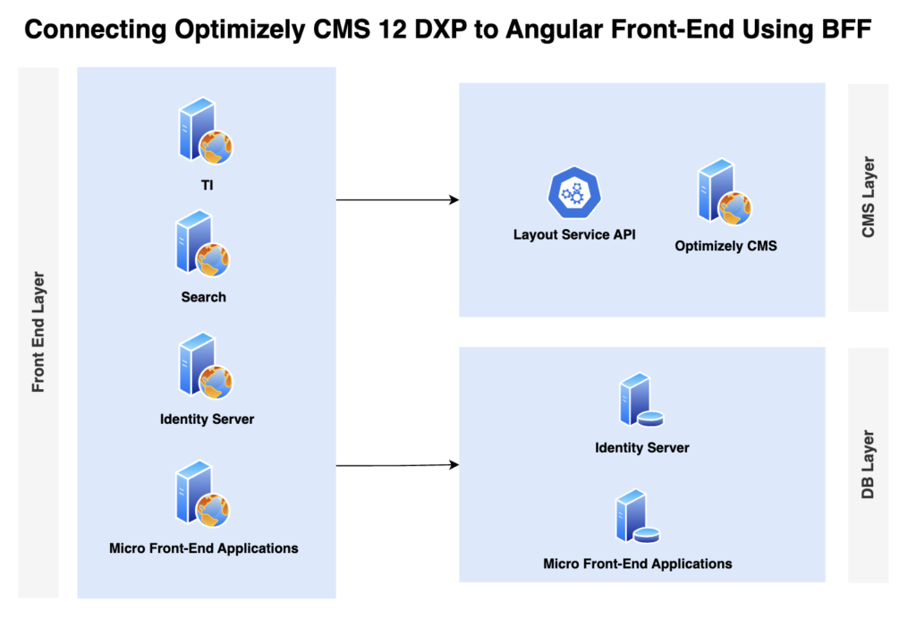
Bridging Optimizely CMS and Angular with BFF Pattern

Introduction

We recently worked on an Angular-based project where the front-end team was developing in a micro-front-end architecture—completely isolated from the back-end and with no exposure to Optimizely CMS. Their world revolved around Angular development and independently deployed micro-front-end applications.

Our challenge was to introduce Optimizely as the CMS backbone for content authoring and to manage the content tree structure. We needed a foundational architecture that allowed both front-end and back-end teams to work productively and in parallel across sprints—without stepping on each other’s toes.

Connecting Optimizely CMS 12 DXP to Angular Front-End Using BFF
Read More

Understanding Optimizely DXP Environment: A Comprehensive Guide

Introduction

Having recently worked on an Optimizely project, I gained valuable insights into the capabilities and best practices of the Optimizely DXP environment. This experience reinforced my understanding of its scalability, security, and performance optimizations. I worked on a migration project from Sitecore to Optimizely, which involved migrating five complex websites originally built on Sitecore and WordPress to Optimizely. This migration required careful planning, content restructuring, and performance optimization to ensure a seamless transition. To successfully deliver this project, I collaborated with an incredible team of 25+ professionals, each contributing expertise across development, architecture, quality assurance, and deployment.

Optimizely Digital Experience Platform (DXP) is a powerful cloud-based solution designed to help businesses deliver exceptional digital experiences. It provides a scalable, secure, and high-performance environment for managing and optimizing content. This blog will explore the key components, benefits, and best practices for working with Optimizely DXP.

Read More

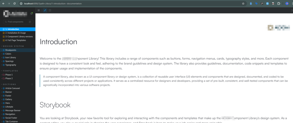
Deploying Storybook on Vercel Using Azure DevOps

In this comprehensive guide, we’ll walk you through the step-by-step process of deploying a Storybook project on Vercel using an Azure DevOps pipeline.

Before diving into the repository, it’s important to note that we received a working Storybook project built with the Lit Component Library from another vendor. The project, which uses Node.js, runs locally with the following commands:

npm install

npm build // This command build and store the files in the following folder: C:\Opt\StorybookAzureDevOps\apps\storybook\.storybook

npm run deploy

Although hosting on Vercel is straightforward using Github, Gitlab or BitBucket, there are a few configurations and steps that can be time-consuming to understand for Azure DevOps. We’ll guide you through each step for deploying an application on Vercel using Azure DevOps Pipelines and discuss the challenges you might encounter.

Requirement

  • Storybook project created with the Lit Component Library.
  • Repository hosted on Azure DevOps.
  • Deployment target: Vercel.

Solution

Vercel supports easy integration with GitHub, GitLab, and Bitbucket, but not directly with Azure DevOps. Fortunately, Vercel offers a useful “Azure Deployment Extension” that simplifies the process.

Prerequisites

  1. Vercel CLI
  2. Access to Azure DevOps Project
  3. Vercel Account

Step 1: Login to Vercel CLI

Open your command prompt as an administrator and log in to Vercel:

vercel login

Follow the Vercel login verification process to authenticate.

Step 2: Create a New Vercel Project

Use the following command to create a new project on Vercel:

vercel project add

Step 3: Retrieve IDs from Vercel

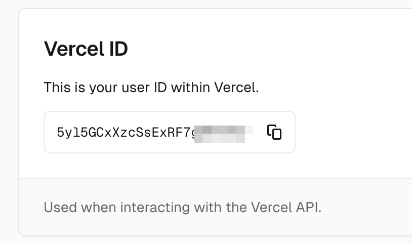
User ID: Navigate to your Vercel account settings to find your User ID.

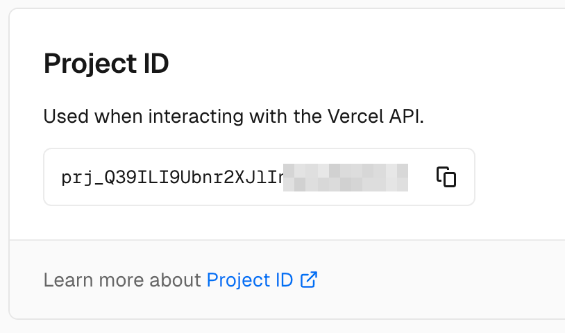
Project ID: Copy the Project ID from your newly created project on Vercel.

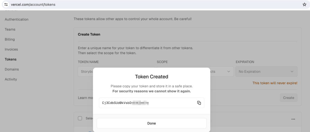
Step 4: Generate and Copy Token from Vercel

Generate a token in Vercel and copy it for later use.

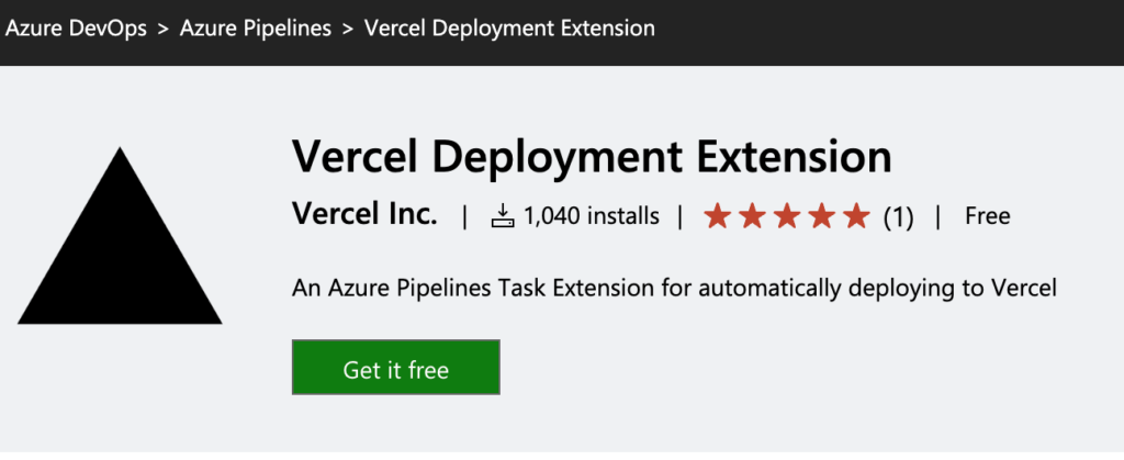
Step 5: Install Vercel Deployment Extension on Azure DevOps

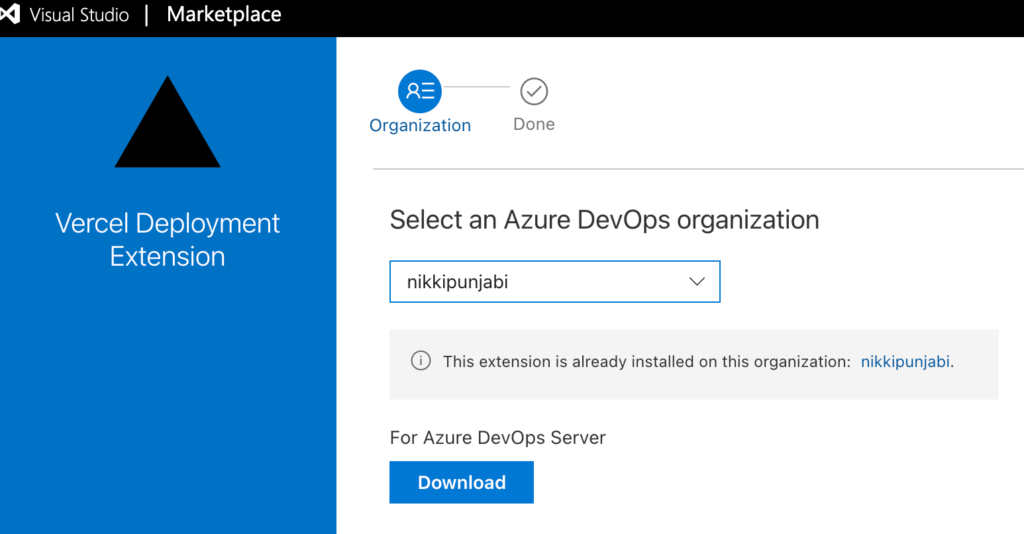
Install the Vercel Deployment Extension from the Azure Marketplace. This requires administrative access. If you don’t have administrative access, request installation from your Azure DevOps administrator.

If you don’t have administrative access, you can still make a request with a reason for installation when you click “Get Free” during installation. This will notify the Azure DevOps administrator. You cannot proceed further without this extension on your Azure DevOps account from where you need to deploy the application to Vercel.

Step 6: Create and Configure an Azure DevOps Pipeline

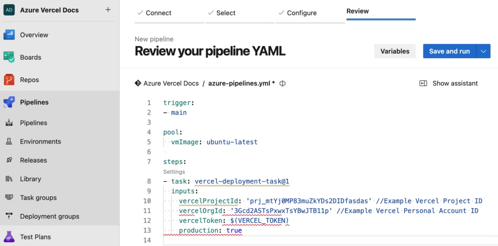
Create a new pipeline in Azure DevOps using and select Node.js for pipeline configuration. Replace the pipeline code with the following configuration:

trigger:
- master

pool:
  vmImage: ubuntu-latest

steps:

 - task: vercel-deployment-task@1
   inputs:
     vercelProjectId: 'prj_cltU1Fkd83L5zDu3l75111111'
     vercelOrgId: 'AHL7CcMKgGf1M01RCD111111'
     vercelToken: 'EthBDqCsSIapPw0Axpqn11111'
     production: true
Azure DevOps Vercel Pipeline

Replace your_vercel_project_id, your_vercel_org_id, and your_vercel_token with the values you retrieved earlier.

Note: If you do not have the extension installed, you’ll see an error within the pipeline because Azure DevOps will not be able to find the required command for the pipeline without the Vercel Deployment Extension.

Step 7: Run the pipeline

Run the pipeline to deploy your project to Vercel. If you encounter errors, ensure your configurations on Vercel are correct.

Configurations for Storybook on Vercel
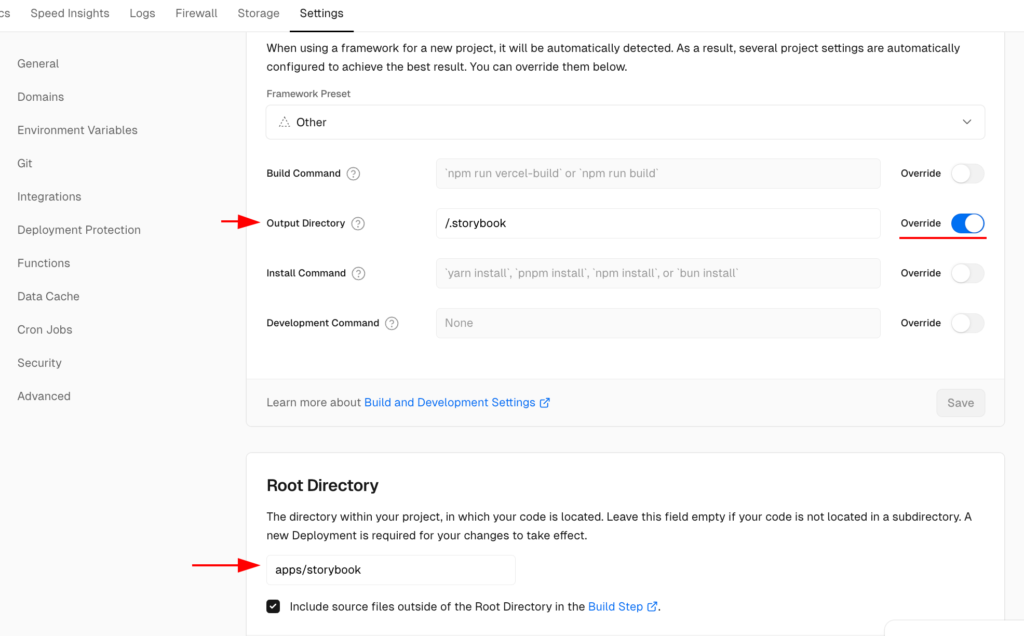
Set the proper configurations in Vercel:

Output Directory:/.storybook
Root Directory: apps/storybook

Vercel Project Configuration

In our case, the output directory should be “/.storybook” and the root directory should be “apps/storybook“. You’ll need to set these according to your Storybook configurations.

Step 8: Set Environment Variables

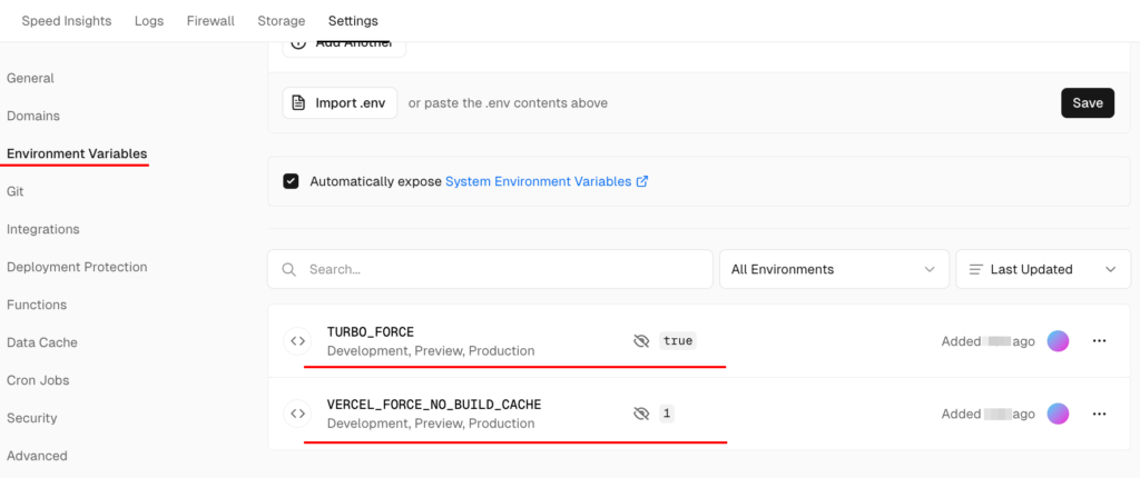
Configure the environment variables on your Vercel project as shown in the screenshot below. This will ensure the cache is refreshed upon each deployment.

Vercel Environment Variables

Step 9: Redeploy the Pipeline

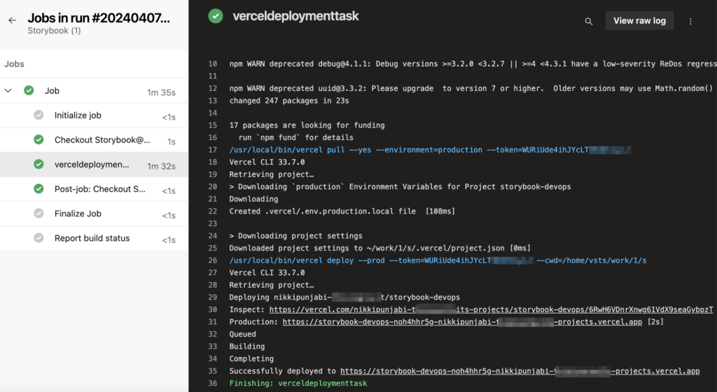
Once the configurations are complete, rerun the pipeline on Azure DevOps. This time, the deployment should be successful, and you should see the results.

Azure DevOps Pipeline

Additional Resources

https://vercel.com/docs/deployments/git/vercel-for-azure-pipelines

By following this guide, you should be able to deploy your Storybook project on Vercel using Azure DevOps Pipeline efficiently. Happy deploying!

Navigating Sitecore Security: Unveiling Azure Firewall Challenges

In the realm of enterprise applications, the firewall stands as a pivotal guardian against potential threats. This blog delves into a specific scenario where Sitecore support facilitated the implementation of Web Application Firewall (WAF) on Microsoft Azure for a Sitecore Managed Website. With WAF in place, access to the App Service was restricted solely to the Firewall’s IP, resulting in a 403 Forbidden error. The intricacies of pinpointing the exact rule causing this restriction within Azure Firewall are explored.

Simple Web Architecture:

Note: This diagram is created only to explain the basic scenario for this blog post.
Read More

Fortifying Sitecore Web Applications: 7 Best Security Practices & Solutions

In the ever-evolving landscape of web development, ensuring the security of your web applications is paramount. This holds especially true for platforms like Sitecore, a powerful content management system used by many organizations worldwide. To protect your Sitecore web applications from potential threats and vulnerabilities, it’s essential to implement robust security standards. In this blog, we will delve into the key aspects of security standards for Sitecore web applications and explore the best practices to fortify your digital assets.

Security Standards – Sitecore Web Application

Security plays an indispensable role in safeguarding any .NET application, ensuring the perpetual safety and integrity of your servers and applications. Regular employment of security tools and site scans is essential to ascertain that best practices are consistently upheld, preserving the sanctity of your website and environments.

Read More

Oracle Eloqua Pros and Cons | Sitecore Integration | Eloqua Series | Part 8

Our Eloqua Series is coming to an end, where we’ll discuss Eloqua’s pros and cons as well as the integration with Sitecore CMS.

Listing all the blogs of the Eloqua Series:
Oracle Eloqua Reports to Google Spreadsheets | Eloqua Series | Part 7
10 Email Marketing Best Practices | Eloqua Series | Part 6
Eloqua Insight | Oracle Business Intelligence (BI) | Eloqua Series | Part 5
Custom Data Objects [CDO] | Eloqua Series | Part 4
Eloqua Forms | Oracle Eloqua Series | Part 3
Email Campaigns | Oracle Eloqua Series | Part 2
Oracle Eloqua – Marketing Automation Review | Part 1

Oracle Eloqua

Eloqua is one of the leading email marketing platforms. Below are the Pros and Cons of Eloqua.

Pros:
API IntegrationsEloqua Rest API integration is incredibly straightforward to set up and customize with any system. The main approach for the integration should be Forms, as I stated in an earlier blog post. There are two types of integration with Eloqua, one for the Sitecore Forms and the second for System forms or fixed forms like registration, login, newsletter subscription, etc,. In our case, we have a Sitecore Submit Action called “Submit to Eloqua” that is linked to Eloqua. We construct a form on Sitecore Forms, and the exact same form is built on Eloqua. We then connect the two forms using the Sitecore Submit Action, passing the correct Eloqua Form ID and other fields in the necessary JSON format. And for System forms obviously, we need Developers to set up a one-time configuration.

Bulk API Integration – Earlier I created the utility to transfer the users in Bulk from the SQL database to Eloqua. It was really easy to understand and implement the Bulk API Integration. This is used to send large amounts of data to Eloqua. I also created a scheduler that runs every day at midnight and sends the daily new users to Eloqua.
Read More

Oracle Eloqua Reports to Google Spreadsheets | Eloqua Series | Part 7

Nowadays, we always look for ways to automate. This blog post explains how to automate the process of exporting the Eloqua reports to Google Spreadsheets and share them with different stakeholders.

In Eloqua Series – Part 5, we created the reports using Oracle BI, in this blog post you’ll see how can you send that data directly to Google Spreadsheet and also create Data Studio Dashboards.

By making use of the scheduler within the Oracle BI tool you can send the required report by email. You might not have heard about Microsoft Power Automate – but using Power Automate you can send that report to Google Spreadsheets or Google Drive or Microsoft Onedrive and you can do a lot more processing and automation by using Power Automate.

Read More